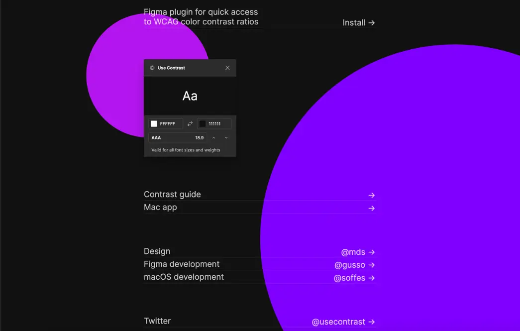
Use Contrast
Color Accessibility
Use Contrast is a tool designed to ensure color accessibility in digital design by checking color contrast ratios. It helps designers create visuals that meet accessibility standards, making content readable for all users, including those with visual impairments. With an intuitive interface, Use Contrast streamlines the process of verifying compliance with WCAG guidelines for an inclusive user experience.
✨ New Tools